Blizzard Support Portal
Objective
This web portal was designed to assist Blizzard game players and customers in quickly solving their issues and returning them to their gameplay.
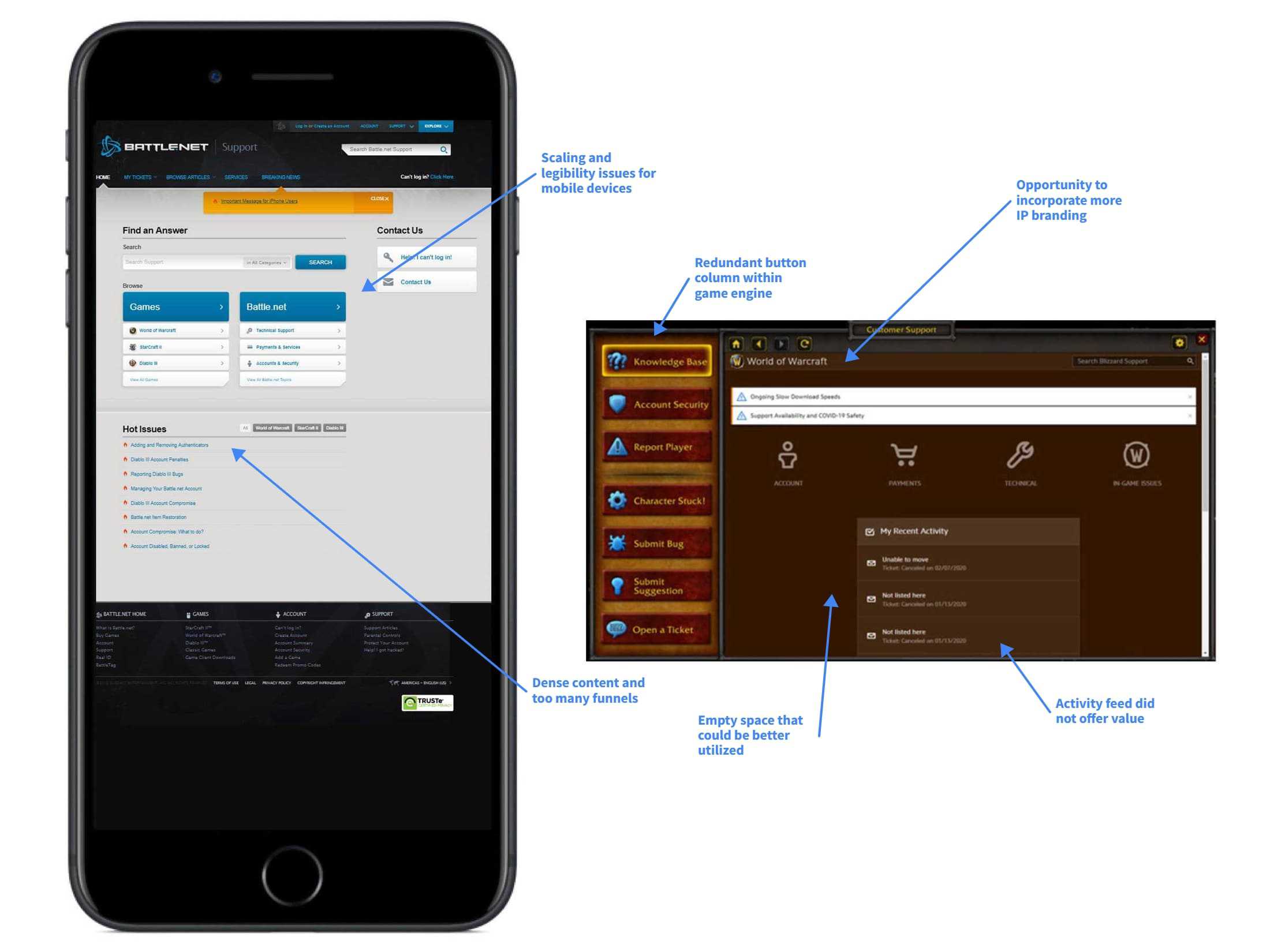
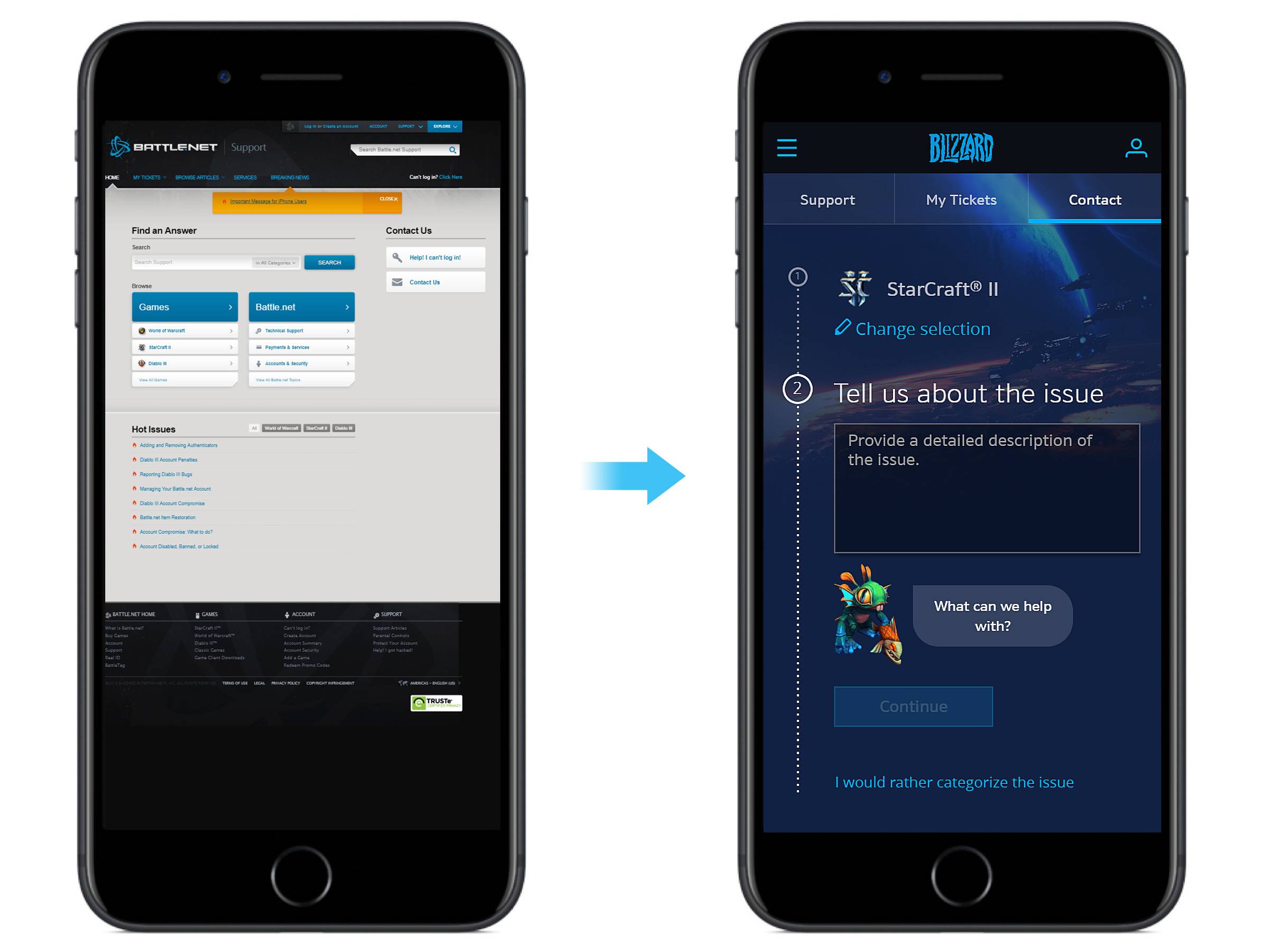
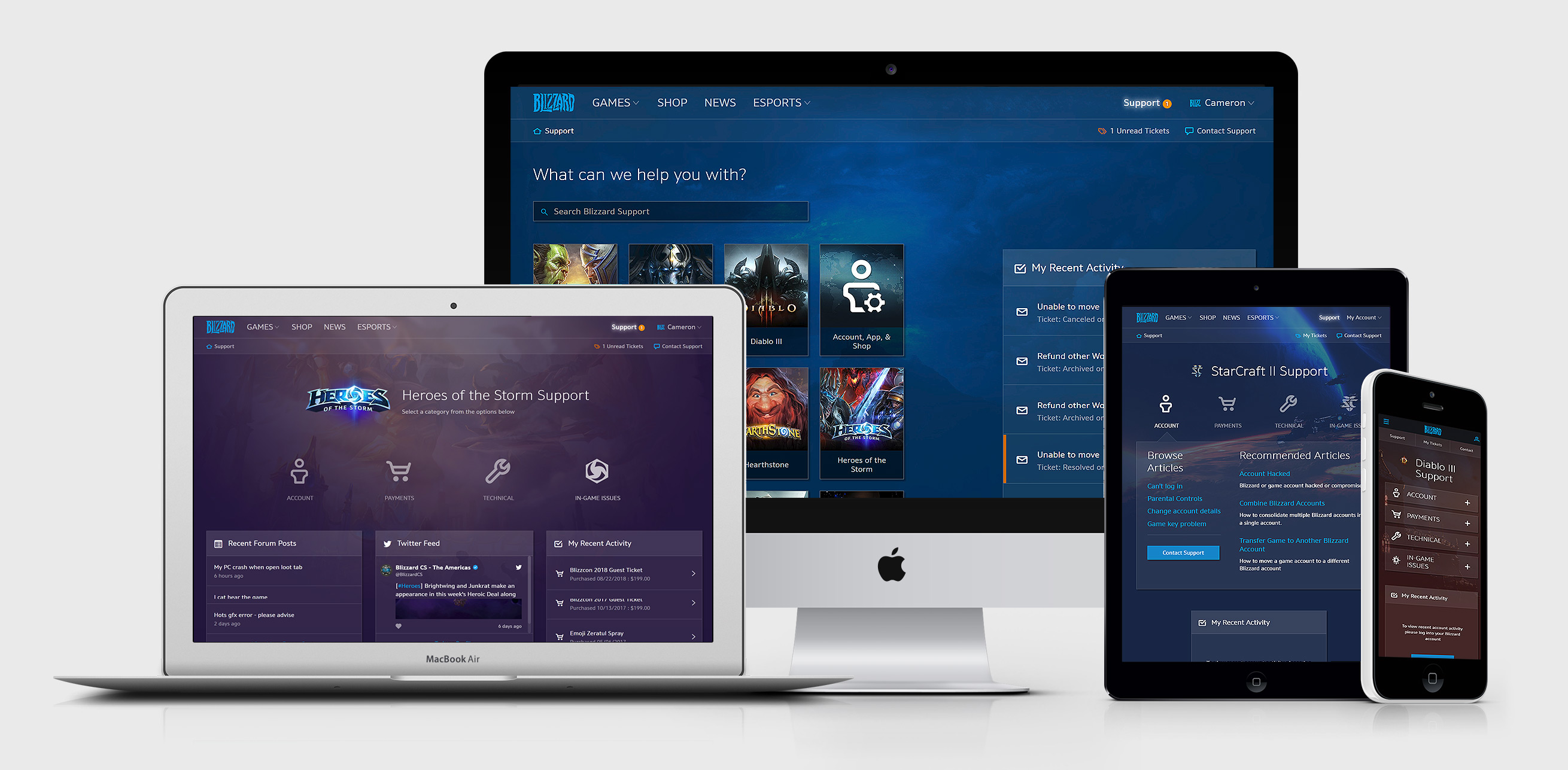
Our reports showed that a growing number of users were beginning to visit the website with mobile devices as our games were going mobile. A ground-up overhaul was required to bring the interface to modern design standards. The support site offers useful resources such as self-service automations and knowledge-base and community driven articles with regards to account, technical, and gameplay related issues. Should these solutions not help, escalating the issue to a customer service representative should be simple and straight forward.
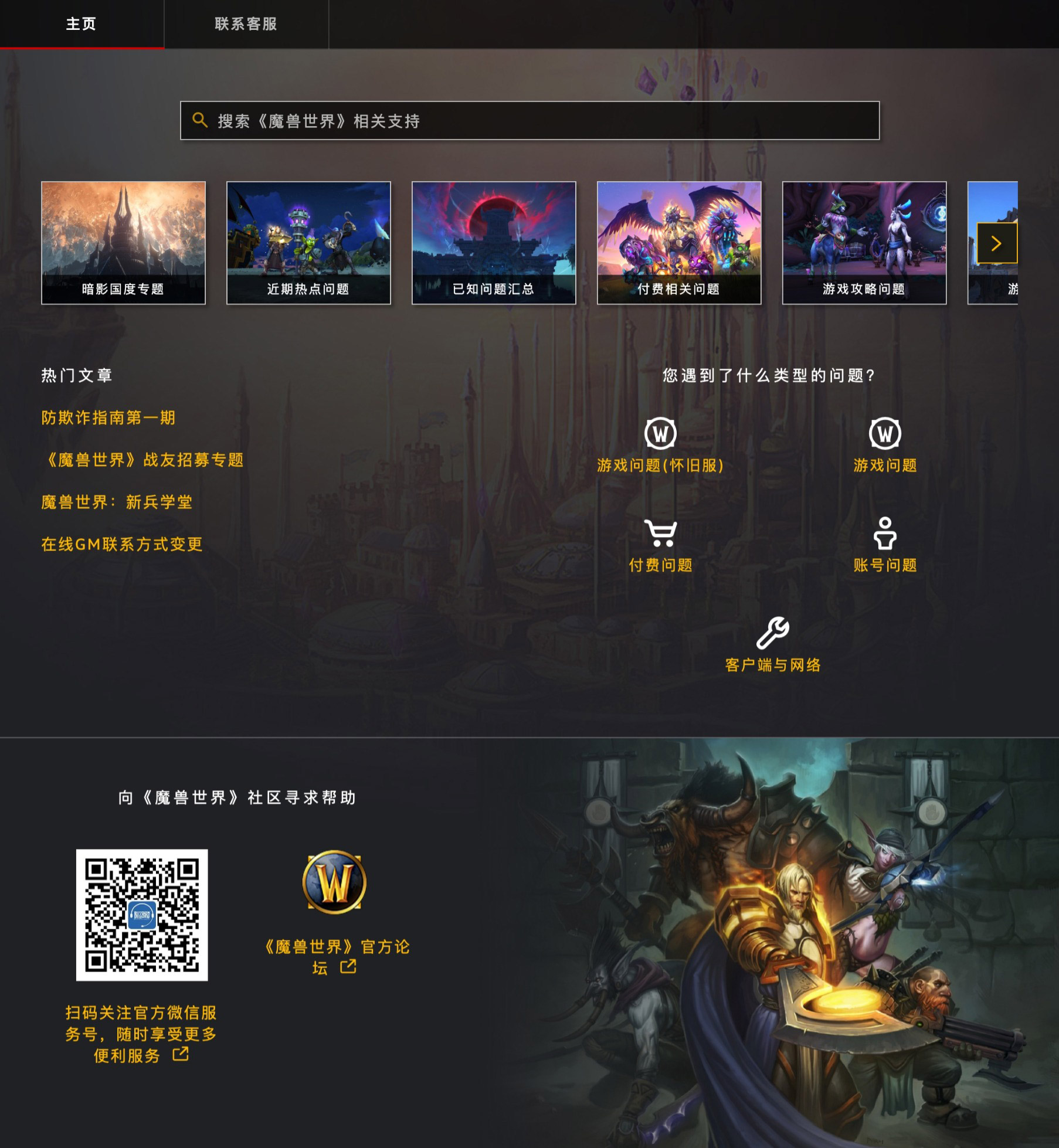
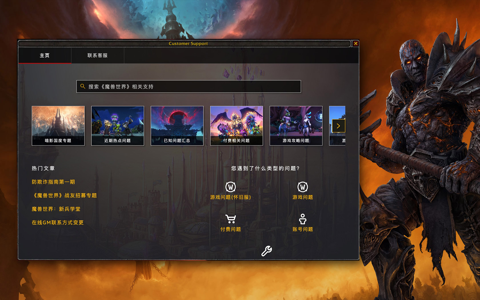
In addition, game development teams were increasingly requesting modernizing or adding embedded support portals in their games. This kept players immersed and prevented them having to exit load external web browsers.
Research
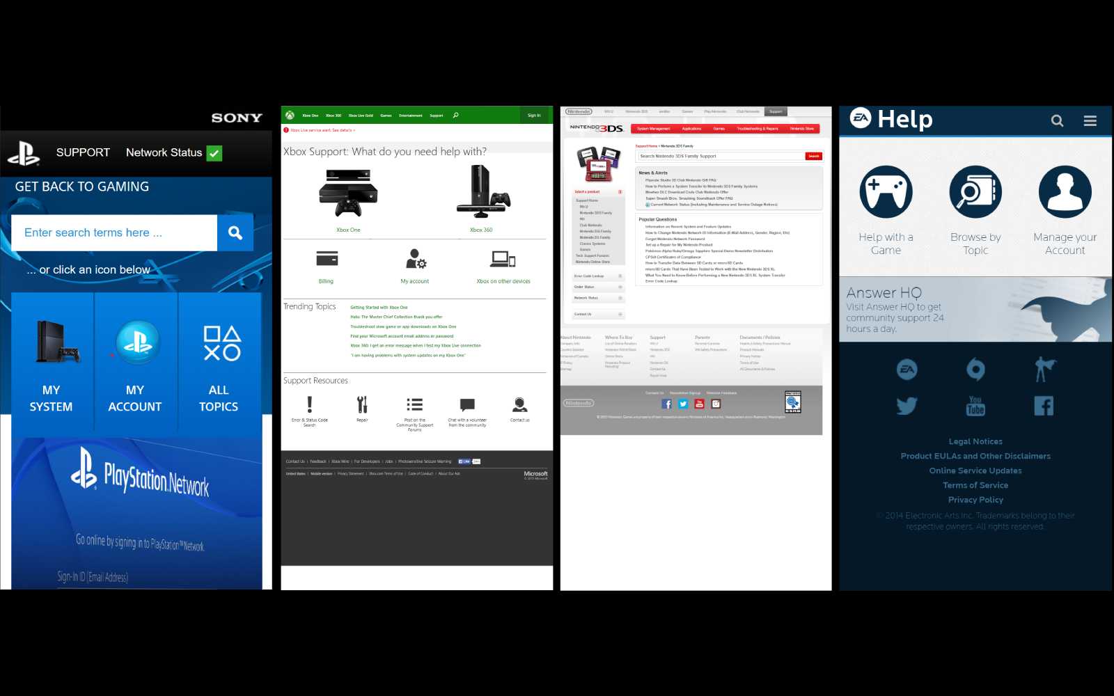
It was important to look at how our competitors handled their support sites and how they functioned. We looked at big names such as Playstation, Xbox, Nintendo, EA, and others. We found that some were mobile responsive while others felt similar to ours. It was also interesting to see how they structured their content with regards to browsing vs searching for content.
We looked into our Google Analytics and discovered that most of our customers were landing on our site from Google searches rather than searching from the search bar on the Blizzard support site. This made us rethink our user journey.
In our early stages, we also did guerilla testing around the Blizzard campus. We used lower fidelity prototypes to see how users that weren't familiar with the website would interact with it. We took it a step further by inviting external users to test the website in various iterations. I assisted our dedicated UX researcher in facilitaing these formal usability tests using features like eye tracking within Morae Observer software.
Style Tiles
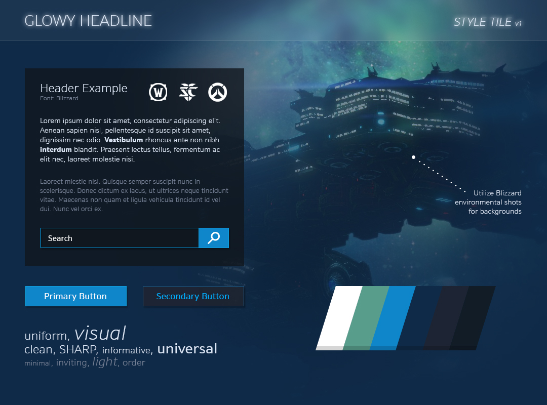
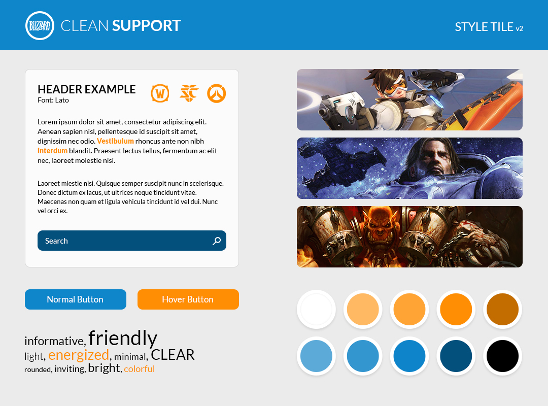
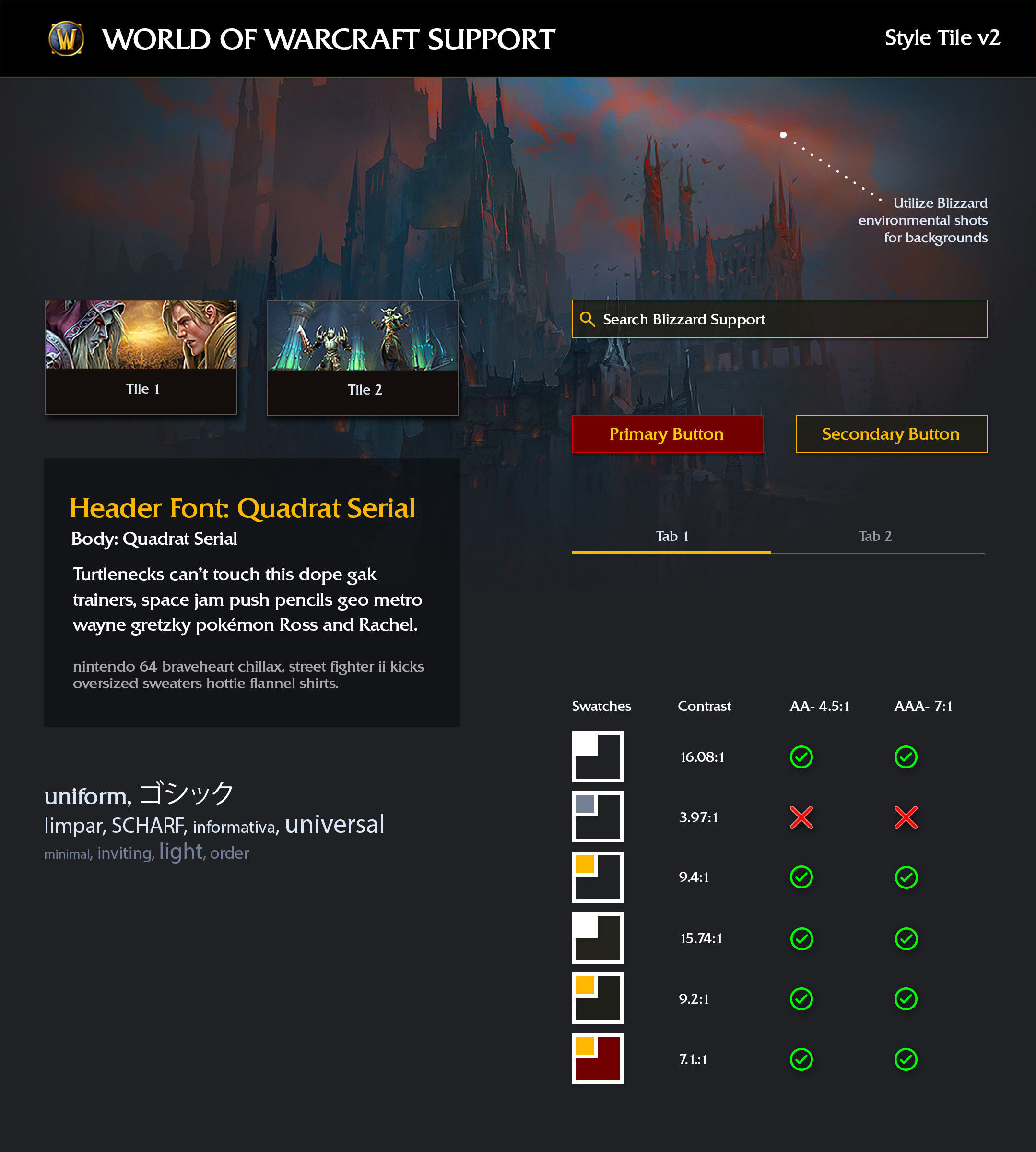
The previous rendition of the Blizzard Support portal did not adhere closely to the company's brand guidelines. To address this, the first exercise was to create style tiles to illustrate various design directions we could apply to the whole website.
Component Libraries
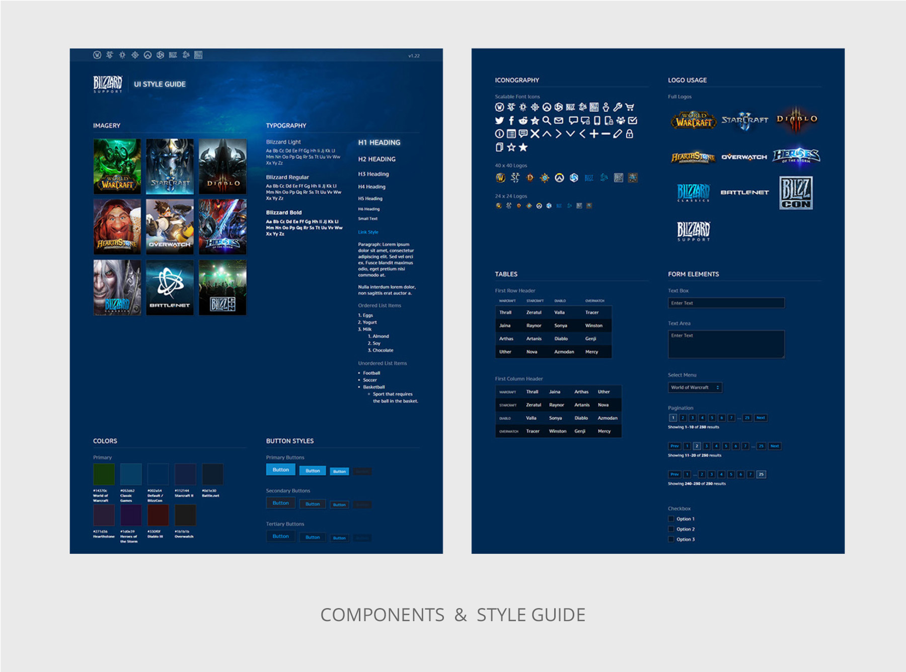
The next step was to start building component libraries and style guides for other designers and developers to use as patterns. This ensures consistency across the site which is critical.
Prototyping and Animation
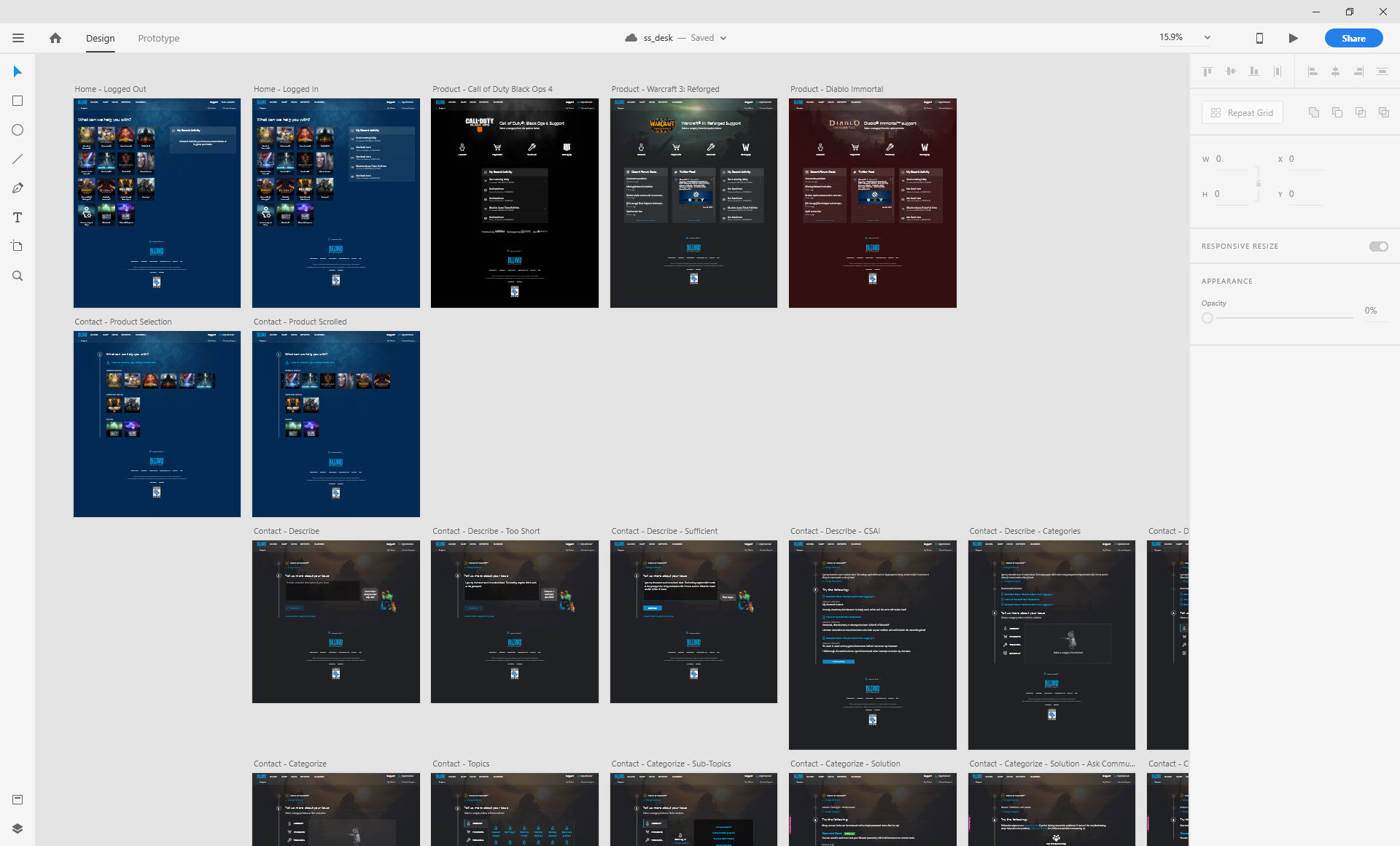
Next, these UI components were applied to low fidelity flows created in collaboration with UX designers to transition them into high fidelity mockups.
Micro interactions and animations were then created between screens to build out a working prototype. This helps illustrate the design flow to various stakeholders.
Design Specs
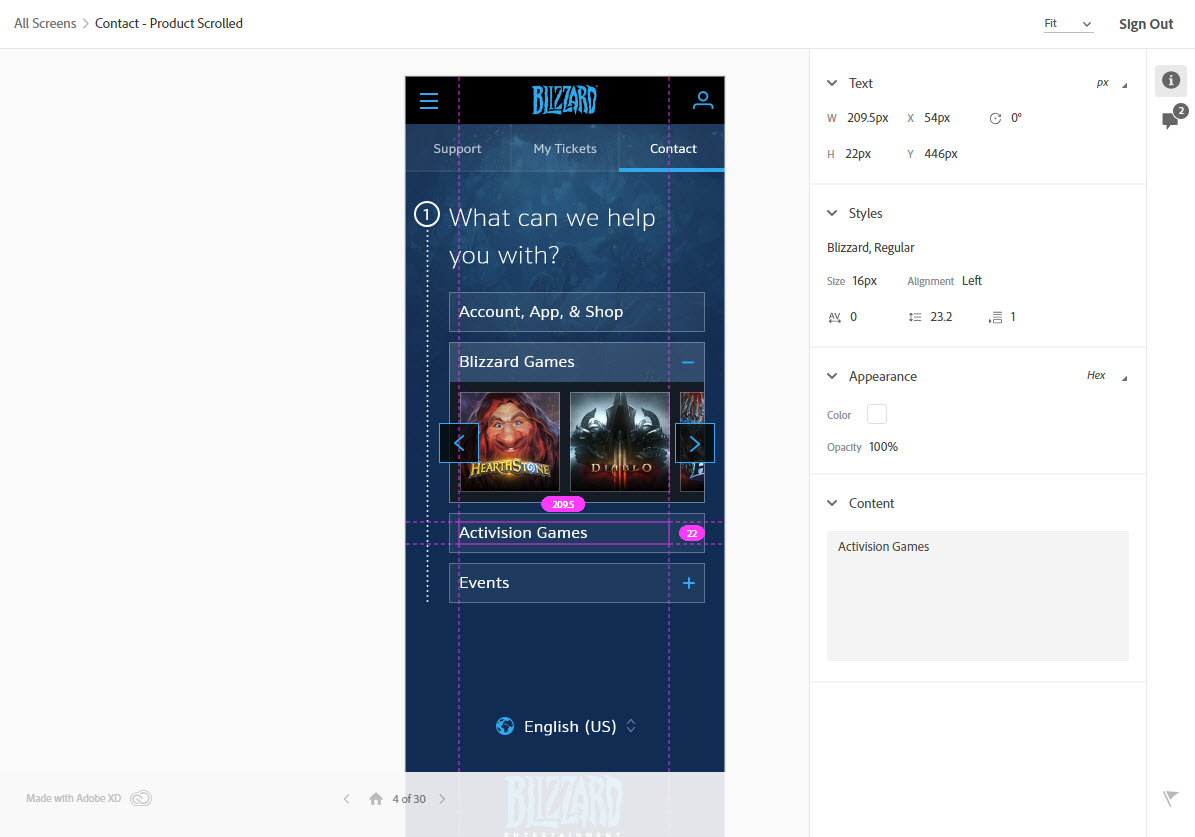
In order to reach the level of fidelity the design team was seeking on the final product, detailed design specs were provided to the engineering team.
Localization
Establishing a close collaboration with regional stakeholders across the globe early in the development process was critical to meet specific player needs. New functionality was introduced for various regions and languages while being mindful of existing constraints.
Reflection
Looking at the transformation to the newly redesigned game experience, several key goals were reached. Our metrics showed an increased success rate for customer self-services, resulting in less contacts. This resulted in drastic financial savings for the company.
Though we succeeded in areas, there were other initiatives I would have liked to see out.
There were ideas to improve the service recommendation systems with machine learning algorithms to give better answers to users. I would have liked to translate the component libraries from design to code environment to assist developers. There is also a growing effort into making the site compliant with regards to accessibility and catering to those that require assistive devices.
